LandlordMax New Features
It’s already been almost 6 years since LandlordMax transitioned to being web based and a lot has happened since then. Today we’re ready to announce a major upgrade coming this weekend. It’s the culmination of a major upgrade to the underlying framework along with many new features and benefits that you asked for. Below is just a sample of some of the bigger and more interesting features. And even though we tried to keep it smaller the list is quite large.
New Dashboard
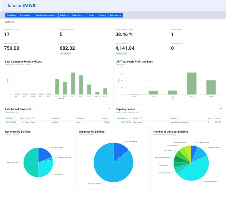
As seen in the image above we took advantage of this upgrade to completely redesign the dashboard from the ground up and have significantly improved it, bringing it up to a whole new league. And we’re not done, we are planning to further upgrade it in the future. That being said the goal of the dashboard in this upgrade is twofold. First it’s to help you see the status of your portfolio at a quick glance. And two it’s to allow you to perform some quick and common actions such as processing late payments right there and then on the dashboard without having to go drilling into the different sections of the software.
The top two rows of the dashboard consist of some quick metrics. The first row consists of: the total unit count, the number of vacancies (of current units), the vacancy rate (of current units), and the number of expiring leases. The second row displays the amount of late payments, your month to date profit (along with an indication arrow), your year to date profit (also with an indication arrow), and the number of tenants moving in.
We then move onto two profit and loss charts, the first one showing the monthly P&L for the last twelve months and the second showing the yearly P&L so that you can get some quick comparisons as to where you are right now.
The next section are two tables. The first to help you see and deal with late payment. The second is to show you upcoming leases that are about to expire in the near future. And not only can you adjust how the tables are displayed but you can also right click on any entry in both tables to perform actions on those entries, saving you from having to go find the entry in the software. So for example let’s say you have a late rent for a tenant you can see it right there. If you just received the payment you can just right click on that tenant’s late payment in the dashboard and process it right there on the spot. This is especially handy if you just need to quickly process a few late payments. And if there are no late payments or any expiring leases you’ll then be presented with a green label to indicate that everything is good.
Lastly we have a few pie charts. The first two show the revenues and expenses grouped by building over the last 12 months. As a side note if you hover your mouse over the pie chart you will be presented with a popup showing the amount for each building. The third pie chart shows you the number of units grouped by building, and again you can hover over the building to get the exact number of units. This has been added to help make it a lot easier to confirm your unit count matches up with each building in addition to letting you know how your rentals are allocated between your buildings.
The dashboard has a few more features, and as previously mentioned we plan to continue to expand it, but to keep things shorter we’ll just cover the above new features of the dashboard for today.
Redesigned Tables

The tables have also been completely overhauled and have a lot of new features and improvements throughout. It’s so significant and extensive that we’re going to break down some of the bigger improvements into their own sections rather than trying to cram everything in one section. And we’re not even going to cover everything, just the main highlights. Some of the improvements include a new single search field, data filters, completely new in-table editing, right click actions on the table itself, column selection, settings, and so on. Again we’re mainly going to try to cover the highlights otherwise this post would be too long.
Table - Single Search Field
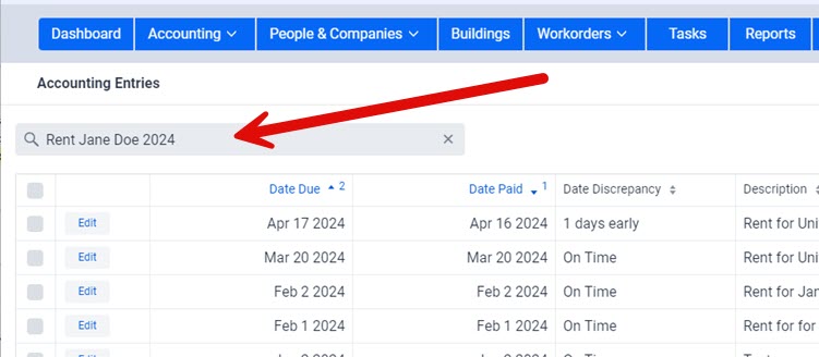
Searching has moved from a search field on top of every column to a single search field on top of every table that will search through all the data in the table in one step. As shown in the above screenshot your searches is over all the data. In the accounting entries table this would mean the search field will try and match your search criteria over the name of the tenant, the building, the dates, the amounts, and so on, all in a single search query. And what’s more it will even do searches on partial values, so for example “Ja” will match with “Jane Doe”. In the above screenshot the search matches up to any “Rent” category, any description with the keyword “rent” in it, and so on. But to further isolate the date it also has to match up with Jane Doe and 2024.
This gives you a lot of power with very little effort, and the search can all be done in one place without having to remember what other search fields had also been set. What’s also really nice is that the search will update as you type so if all you need is “John” to limit the list of entries for “John Smith” because you only have one person named John then that’s all you need to type. Just a quick tip, please keep in mind it searches over all fields, which includes hidden column. As well if you type in something like “th” then please note that this will in turn match with any description containing the word “the” as it contains “th”.
Table - Editing
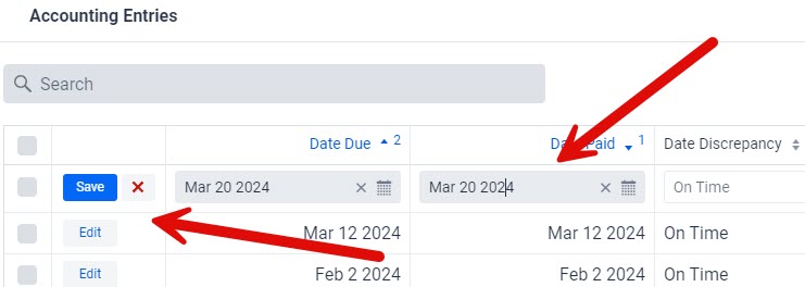
The ability to edit directly in the tables rather than having to go to the form view has been greatly improved with a whole new and more powerful web technology. The layouts and designs are much cleaner and easier to work with and everything is a lot smoother. There is now a new Edit button available that’s always on the left side so that in addition to doubleclicking to edit you can also now also instead click on the Edit button. The Edit button will transform to Save and Cancel buttons that are always visible to make editing very quick. This is especially useful if you want to quick edit a date or an amount, you don’t have to scroll back to the left to get back to the Save and Cancel buttons, they are always there ready for you. As a quick preview you can now also select to edit the row by right clicking and then selecting the Edit/Table option but that’s getting ahead of ourselves and is covered in the next section.
Table - Action Menus
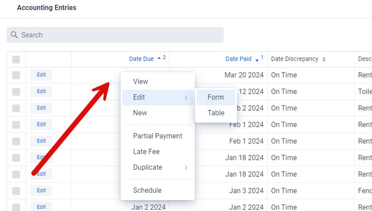
Right clicking on the table has been changed from selecting the columns you want to show/hide to a new action menu for the entry you just clicked on as shown in the screenshot above. The main goal of this feature is to save you from having to select the entry and then moving your mouse back and forth to the actions on the right side menu. It might seem like a small quality of life improvement but it quickly adds up and it’s very hard to do without it once you get used to it. So much so that it’s almost impossible to imagine not having this feature once you start using it. It may appear small but it is a big quality of life improvement because we’re always performing actions on the data in the software, that’s what software is for after all. And the bigger your computer screen the more valuable it becomes.
The list of actions is dependent on what table and item you are clicking. For example the above screenshot is from the accounting entries table therefore you can view the accounting entry, edit it (either in the table directly or go to its full form view), you can create a new accounting entry, apply a partial payment to the entry, a late fee, duplicate it, and so on. The only action that is never available in the popup action menu is the delete option, and this is intentionally done as a safety measure. Deleting has to be done by selecting the row and then clicking on the Delete option on the right menu. In other words you can’t just accidentally hit the right mouse button and then slide to a delete option. You have to select the entry by clicking, then move your mouse across the screen and click on another button.
Table - Data Filters
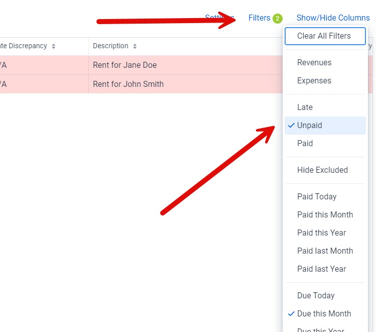
You can now filter the data in the accounting entries tables in addition to searching so that you can limit the data displayed. An example is that you may want to only show late entries that are due this month. Or maybe you want to show all entries that were paid this month. There’s quite a lot of options, especially considering you can combine some of the filters. You can of course turn off the filters at any time by using the Clear All Filters option.
Please note that the data filters are remembered, meaning if you go into an entry, come back the next day, and so on, that the filters are still applied. The system has a small green circle with a number to indicate the number of active filters. With that in mind it is important to be careful should you ever find yourself not able to find an entry to check if a filter is not applied that may be filtering that entry out of the table. If you still can’t the entry you’re looking for it may be a good idea to clear all the filters in case there is a data entry error which is further filtering it out from the table.
Table - Moved Column Selection
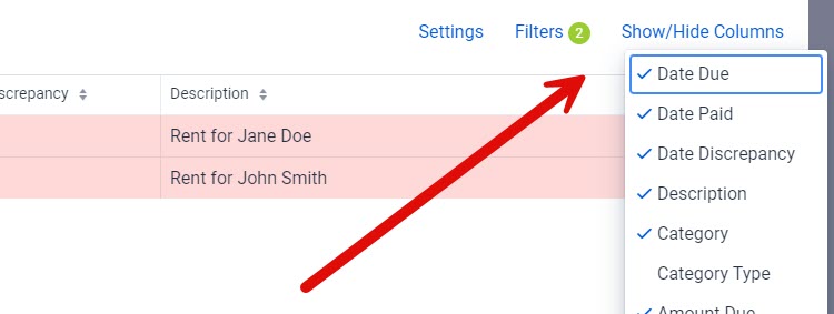
This is more of an adjustment than a new feature but we wanted to include it here so that you didn’t think we removed the ability to select columns, instead it’s just been moved to the top right of the table so that we could use the right click on the table for the action menu.
Table - Settings

The size the tables should be is something that is very subjective. For example we used to have a lot of requests to increase the size of the tables to make them easier to read and navigate. Then once we did that we started to get a lot of requests to shrink the size of the tables so that they could display more information. Which is better? Well it depends on you, your needs, your screensize, and so on. So rather than go back and forth between different sizes we’ve now added the ability for you to select yourself between a more compact table with more data or a slightly bigger, more spacious that is easier to read. The choice is now yours. If you prefer a smaller more compact table that can display more data than you can select that option. Of if you prefer a bigger table that is easier to read than you can select that option.
You may have noticed a Reset Table option in the Settings menu, this option will reset every option on the table to its defaults, including the data filters, column widths, column ordering, and pretty much everything else. The tables are very customizable and should you ever find yourself in a situation where you’ve moved too many things around, setup too many filters, and so on, well you can now just click on this option and everything will be back to the defaults. This is also very handy if you want do some short term customizations such as moving columns around and setting filters to find a specific set of entries and then just want everything to go back to the original default settings.
Exclude Replaces NSF
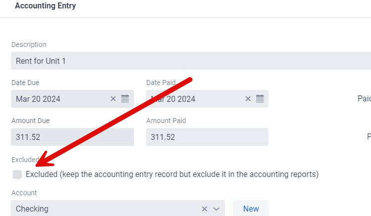
This is probably the biggest change in terms of how the software works. It’s small in terms of what it does but it does slightly change the behavior within the software which is why it’s here. That is to say that in addition to change the name of the term NSF to Excluded we’ve also slightly expanded what it does. Originally NSF was meant to be a misnomer to help give you an indication of what it means but as checks are less and less common combined with how the software is used these days, well the NSF misnomer no longer really works that well, and so it’s been changed to Exclude which is a much more meaningful name. Especially considering we’ve expanded its functionality.
Exclude, similarl to before, means that you want to keep the accounting entry but really only for documentation purposes. It is not included in any of the accounting reports, but now it’s also not included in the late payment reports. It’s completely excluded from the accounting reports, hence the term Excluded. In fact we added 3 new reports that just list the Excluded entries should you need to run reports. As well there is now a data filter which allows you to hide excluded entries from the accounting tables. On a side note please note that you can also search for “excluded” in the search field as an alternative to using the data filters.
An example of using Excluded is that you could be dealing with a very long and drawn out court case to collect some old unpaid rents and you really don’t want those late rent payments to appear in your day to day list of accounting entries, or even in things such as the late payment reports. You can then mark them as excluded at which point they will remain in the accounting entries table but they will not appear in any of the accounting reports. They will still be available in the accounting tables but you can also hide them by selecting the appropriate data filter. In other words they are still there but just out of view until you finally need them. Meaning that when you finally do collect the rent you remove the Exclude toggle at which point they are now back as normal accounting entries.
Collapsable Right-Menu
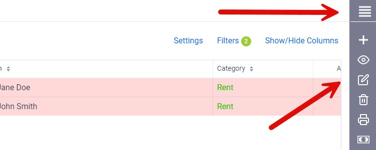
Some people have smaller laptop with smaller screens which can make it more challenging to see a lot of data in the tables. Combine this with the fact that on some laptops you’ll want to use the Large View option on the table because the screens are so tiny and hard to read, that this in turn means you are even more limited with how much data you can display in the tables because there’s very little space left. To help address this the menus on the right can now be collapsed to icons giving you a noticeable increase in screen space on smaller laptops and screens. You can change collapse/expand the right menu by clicking on the 4 lines on the top of the menu as shown in the first arrow on the above screenshot. The software will also remember this as one of your preferences.
Many Report Improvements and New Reports
The reports section has also had a lot of improvements and could simiarly be divided into multiple sub-sections like the tables sections but we’re going to try to keep it all in one section. The show version, that is some of the improvements in the Reports section which will be discussed below include:
- Very significant performance improvements
- Report size on screen can be expanded to take full advantage of the screen.
- You can easily hide/show the charts in the reports
- Print preview has a lot more functionality
- New reports such as the Excluded reports
- Report customizations have been simplified
- Many quality of life improvements to the report customizations
There have been a lot of improvements behind the scenes that are not always visible and a big one is a very significant improvement in the performance and speed of the report generation. This also includes the minimum time to generate a report, even larger reports. These performance improvements also directly address the issue where a report could take longer to generate. Report generation is significantly faster and consistent across the board.
The biggest visual change is that the reports are no longer generated into a word processor but instead are directly generated into the screen. This is done for a number of reasons, from being able to expand the report (described next) to helping with the performance issues.
Before we get into more details we found through random sampling that outside of deleting charts in the generated report (which is also addressed in a few moments with new functionality) almost no one used the word processor on a generated chart. Really the only time it was used was to delete a chart, which can now be done by the press of a button. And if you really do need more customization you can create custom reports and/or export the report as a CSV file which can then be read by a spreadsheet program such as Excel or Google Sheets. But considering how little the word processor was used, combined with the performance impacts, the ability to expand the size of the reports (next section), and so on, the new way reports are drawn directly on the screen is much better. Just the ability to expand the size of the reports on the screen alone is worth the change.
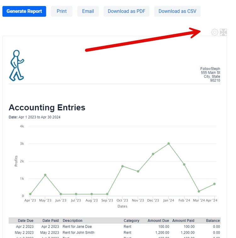
As just mentioned, we’ve added a new feature that allows you to expand the width of the generated reports on the screen. This has been a very highly requested feature that is now available. In more detail the reports are designed to match the size of a printed sheet of paper as best as possible within a web browser so that what you see on the screen matches up with what is printed. The challenge is a lot of people wanted the ability to expand the width of the report on the screen, especially people with larger monitors that have a lot of extra space. Sometimes you just want to see the report on the screen and not print it. Yes the reports are still constrained in that they must be able to fit on a standard sheet of printing paper (assuming you don’t create your own custom reports), however you can now expand the generated report to use the full width of the screen if you want to. To do this click on the expand icon near the top right of the report box pointed to by the red arrow. Just keep in mind that if you expand the report to take the full width of the screen that the printout will not match your screen because your screen no longer really matches a sheet of printed paper, they will be different sizes. The columns are all defined as percentages, so the actual width of the columns will adjust according to how much space is allocated to each column in the report. On a related note the software will remember your if you adjusted the report width and keep using your selection until you change it.
We’ve also added the ability to remove a chart from a generated report by similarly clicking a button rather than having to go in the report and edit it manually. You can do this by clicking on the gear icon just to the left of the expand/shrink icon also pointed to by the red arrow. The software is smart enough to detect when there a chart in the report and so only shows this icon when it’s appropriate. Please note that this option is not saved because it is completely dependent on the report having a chart or not. As well please remember that if there is a report you want to use a lot and remove the chart that you can create your own customized version without the chart.
Although this only impacts those that create custom reports, the report templates themselves have been significantly improved and simplified. As this is more technical (we’ll provide more details later) we will only cover it quickly and from a high level. Firstly the default css styles have all been removed and are all automatically applied which significantly reduces the size of the report templates. Meaning you only see the styles that are custom to that report. You also no longer need to include the letterhead in the templates, it’s always assumed to be there at the start. But probably the biggest change is to the grouped by reports as they now include functions that remove the need for most of the previous code that could make it confusing to less technically inclined people. It not only makes the grouped by report templates a lot smaller, it also makes significantly easier to understand and customize. Lastly the error messages have been greatly improved so as to make them more descriptive and a lot easier to understand, which in turn will help you fix any bugs/errors in your custom reports.
Something else that may be more subtle is that you can no longer modify or delete any of the default reports. You can duplicate them and then customize them to your needs, but you can no longer directly modify them. Our initial goal in allowing this ability was that people could adjust and customize the reports to their specific needs, but we’ve since discovered that it’s much more likely for someone to accidentally either delete or change them in ways they didn’t intend. To simplify everything you can no longer modify the default report templates, but you can duplicate and customize them as much as you want.
Letterhead
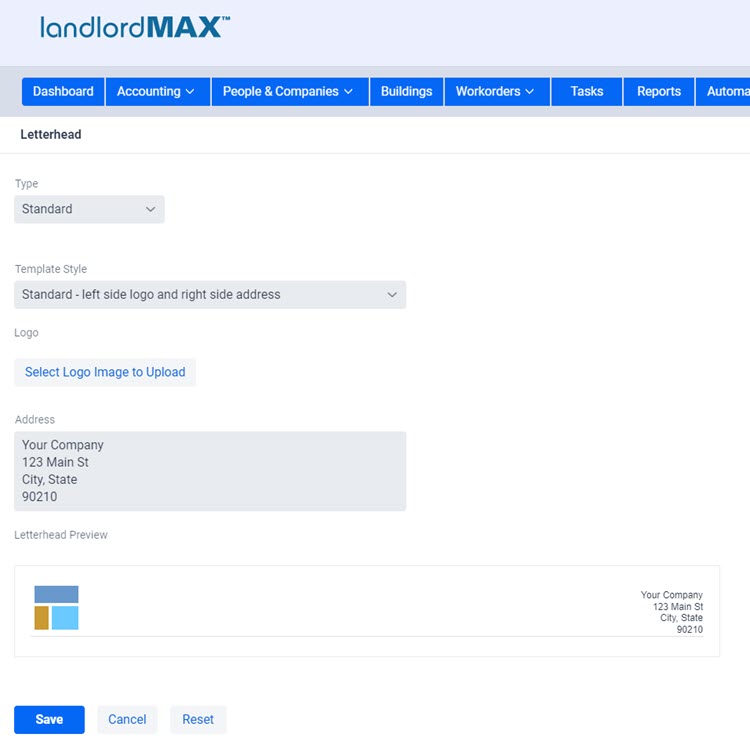
The ability to set and customize your letterhead has been greatly simplified. Firstly we’ve found that most people who wanted a letterhead would just customize the existing template but it wasn’t always obvious for everyone how to do it, even if it was in a word processor. Everyone at some point and time has struggled to get things to align nicely in a word processor. And in most cases people want the same type of letterhead, so why force everyone, especially those less familiar with word processors, to struggle through that. You can still do that if you wish as one of the options, but now there’s an option to just select your logo image file and enter in your address in a textbox and the software will do all the rest of the heavy lifting for you. Specifically you can select from 5 letterhead types: Standard, Advanced, Basic, Image, and None.
Selecting Standard is what the vast majority of people will want. It gives you the option to select from a list of pre-defined letterhead templates which basically have a logo and address in different layouts. It is the simplest and easiest way to setup a letterhead. You just pick your logo image file from your computer and enter in your address in the address textbox. Everything else is all taken care of for you automatically. You don’t need to do or know anything else. The Advanced letterhead gives you full control of everything, and work like the custom report templates. The Basic option is similar to before in that it includes a word processor. The main difference between Advanced and Basic is that you are limited to the word processor’s capabilities in the Basic. After that we have Image where you can just select an image and that’s your letterhead in full. The last option is none and this means you don’t want anything for a letterhead. Again we will generally recommend people use the Standard letterhead option as this is the best combination of being the simplest and generally best looking option.
Top Right Menu

Although this is not so much a new feature but it’s included here so people aren’t surprised by the change. The top right menu has been slightly adjusted with items being moved between the menus. As well the menu has been converted from words to icons. For example instead of your name on the top right it’s now an avatar icon. Next the menu items have been slightly moved around to be more appropriately grouped. For example the avatar icon (formally your name) is now more focused to items related to your account. For example the first item is your name which goes to your profile information, billing, and so on. The System Settings and Your Settings have been moved to the Settings icon (gear cogs icon). And finally the Templates icon which is for the system and report templates.
The biggest shift is that managing the letterhead has moved from the System Templates to the Settings menu as it’s no longer really a template but rather something you setup and configure. And based on our testing it will be especially for new users to be able to customize their letterhead.
SubPanels
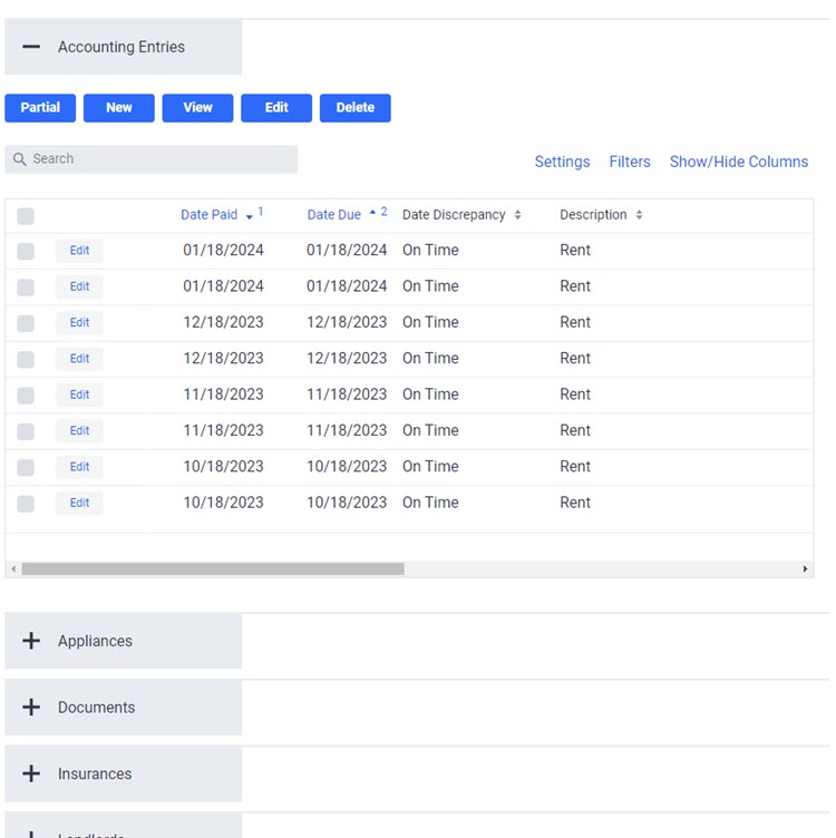
The SubPanels are only being mentioned here because they have visually changed in ways a decent amount in ways to make them more obvious as well as provide new functionality. The first big change is that each SubPanel now has a search box like the main tables such as the accounting entries instead of search boxes at the top of each column. Next you’ll find the action menus have been moved from the right to the left to make room for the new table functionality on the right (Settings, Data Filters, and Show/Hide Columns). We also made the action buttons more prominent in the SubPanels to avoid confusion between the buttons on the right and the SubPanels. There are some other subtle changes but these are the biggest and most interesting ones for the SubPanels.
Emailing
This could almost fall into the next section called Other Smaller Improvements but since it will affect some people in more significant ways we decided to make it its own section. But before we get into the details it is important to cover a bit of background, specifically as it deals with email spam.
Without realizing it some people will send emails to say their tenants that can be incorrectly flagged as spam, or sometimes even intentionally flagged as spam to cause harm. It could be as innocent as a tenant accidentaly hitting the “Report Spam” button in their email account all the way to a bad tenant intentionally flagging your rent payment notices as spam so as to avoid them. In either case if someone does this then that email address will be flagged and no further emails can be sent to that person within the software. This is done to protect everyone, including yourself, because if you keep sending emails to them and they continue to be flagged as spam then your whole email address could start to be marked as an email address that sends out spam emails by the bigger email services like Gmail, Hotmail, Yahoo, Aol. This could then lead to them blocking all emails sent from your email address over time. That’s the last thing we want to happen.
Therefore to avoid these types of issues as soon as an email address is flagged as spam by the recipient the system will automatically prevent any further emails from being sent to that email address. The same is true if the email is blocked (which is slightly different than marked as spam), invalid, as well as a few other reasons. You can re-enable the ability to send emails but for safety and security reasons you’ll need to contact us to re-enable the email address.
The main difference is that in the past the software would silently block the emails and only present an error message if there was an actual error. Blocked emails were just blocked. It’s a form of what is called “shaddow banning”, “stealth banning”, and a bunch of other similar names. There are good reasons to do this but to keep things shorter I won’t go into the details. The short version is that we’re now going to show an error message if the email is blocked by the software due to spam and so on.
That is to say for example if you try to send an email to a tenant that has reported a previous as spam then the software will show an error message indicating that the email address has been blocked. Any adjustments to blocked emails will require you to contact us so to re-enable it. Again this is for everyone’s security and safety, we want to ensure that everyone is able to send emails without issue.
As an aside these spam related issues is why the software currently doesn’t offer the ability to send out mass emails to all your tenants in one step, it’s to avoid exactly these types of issues. Most people don’t realize the potential consequences of sending the same email to many people, and honestly it’s not obvious. In addition to being reported as spam if you send out enough emails with the exact same content you can also run into issues with the bigger email services. And keep in mind they account for a very large percentage of all email addresses. In fact normally it’s recommended to use specialized services to send out these types of email. We ourselves use these types of services for our email notifications, for technical support, for our email newsletter, and so on. In any case the main difference is that now the software will tell you when an email has been blocked.
Other Smaller Improvements
Again there are a lot more improvements than just what is listed here but to try and avoid writing an even bigger novel sized post we decided to try and focus on the bigger and more interesting improvements. Also a lot of the improvements aren’t as visible they are noticeable such as some of the performance improvements. With that in mind below is a further sample of some of the smaller new improvements.
- Improved mobile support
- Performance improvements throughout
- Quality of life improvements throughout
- Modernized designs
- Additional table functionality beyond what is already mentioned
- Additional validations and checks
- And so on
Final Tidbits
Below is a small list of things to be aware as part of the upgrade.
- All table preferences have been reset - They had to be reset to be able to support all the new tables features.
- Old bookmarks need to be re-created - Without getting too technical the underlying technology has changed which in turn has altered the webpage addresses, which in turn means that old bookmarks will no longer work and new ones need to be re-created.
- Custom reports - If you have any custom reports we will be assisting you with the report template changes on a case by case basis.
If you have any questions please feel free to contact our support team here.


