
When you initially login to your account you will be presented with the dashboard which is a quick visual overview of your portfolio along with some potential action items to look into such as late rents and expiring leases. The dashboard also provides you with a quick view of how of your or your client’s portfolios are doing.
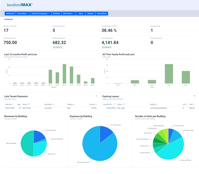
The top two rows of the dashboard consist of some quick and easy to look at metrics including the total unit count, the number of vacancies (of current units), the vacancy rate (of current units), and the number of expiring leases, the amount of late payments, your month to date profit (along with an indication arrow), your year to date profit (also with an indication arrow), and the number of tenants moving in.
Following this there are two profit and loss charts with the first one showing the monthly P&L over the last 12 months and the second showing the yearly P&L.
The next section shows the late tenant payments such as rents and soon to be expiring leases. Both tables can be somewhat customized in how they are displayed along with the ability to perform some quick actions right on the page without having to go find the entry by right clicking on the item you want to action directly in the table. If everything is good and there are no late payments or any expiring leases you’ll then be presented with a green label to indicate that everything is good.
Finally we have a few pie charts showing how your properties are doing. You can hover your mouse of the pie chart for details and exact numbers.